The ABCs of Out Of Home Creative
Washrooms Here ->
Last evening I met a friend in one of the most popular joints in town. As is the case with every other coffee drinking spree, I found myself at the Gents after two rounds.Two ladies walked into the Men's room, and after a synchronised and apologetic oops! they stepped out, as fast as they came in.
Would you blame these beauties for walking into a gent's washroom?
Isn't it clearly marked outside?
I mean, who does that?
Before going further into the disambiguation of whether they were right or wrong, let's all first agree that the signage outside every restroom is an out of home media touchpoint; a directional signage that either tells us to turn right, left or walk right through, depending on our gender, or choices thereof.
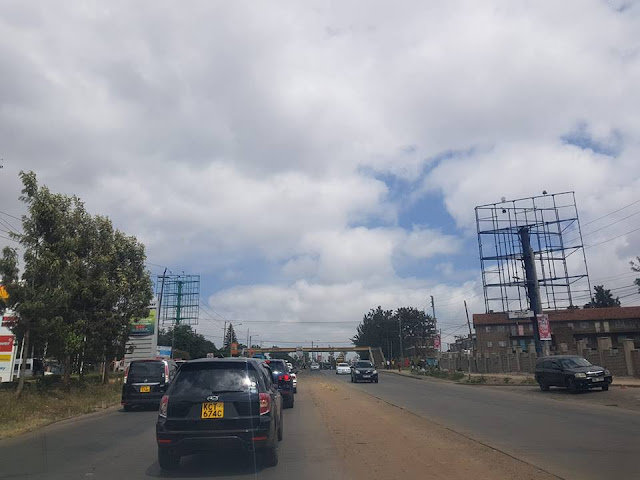
So when I walked out, I turned around and took this picture of the door.

The other door (signage) was positioned on the opposite side of the alleyway, so I could perfectly understand why someone with an urgent need to use a restroom, coupled with dizzy eyes after a few rounds of wine would not look twice at the sign to confirm whether it denoted feminine, masculine, common or neuter.
Now, let's see what I came across in a different restaurant today; these two doors, found right next to each other, a true juxtaposition of each other. And the words GENTS and LADIES clearly embossed below each symbol. It would definitely be unheard of for one to take the wrong route here, no?
Since, as they say these days, the internet never forgets, I am almost certain that by the time my fourth generation reads this, there will be a third or fourth option door, but that's a story for another day...


So is a picture enough to say what you intent on outdoor? It was from that former incident of a misread signage and the expression on the two ladies' faces that this article was born. So let's have a look at OOH creative; copy and colour.
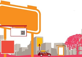
How Much Copy is Enough?
Generally less is more. Five to seven words suffice for outdoor copy on roadside formats where the exposure window is three to five seconds, or seven if you are lucky.More than once in my out of home practice, I have had to 'fight' with clients who ask that we tell the whole story on one billboard panel. Basically asking that we lift a newspaper ad onto an outdoor site. With more that 75% of billboard audience being vehicular, it's always advisable to keep the message simple, clear and easy to read. Naturally, the faster a vehicle moves, the further the driver tries to see, so always take into consideration the perspective effect. A quick check on the vehicle speeds and traffic density at the intended billboard location would help you before final creative sign off.
So the exception to this rule is that we could have a few more words (two or three) on a billboard located at a heavy traffic circle where vehicles and pedestrians stop, and less on one located on the highway and still achieve purpose.
In our next article we shall discuss the different roles that the myriad of outdoor formats out here play in the OOH communication mix and why some should say more than others.
What font works best for my OOH message?
Most brands will boast of brand-books and guidelines that outline what font to use in all forms of communication. Luckily most win this bet. But for those that don't, the below illustration would be a guide for you regarding fonts, upper-lower case blending, spacing between letters, bolding, italicising etc.Font and Copy

Too little spacing merges letters together with heavy letters becoming blobs and thin ones losing visibility at long distances. If you have a high contrast between thick and thin letters, the legibility of your copy deteriorates.
How many colours should I use?
Have you come across billboard creative that looks like an extract form the rainbow itself? I have.The basic rule of thumb is that you need proper contrast and zero colour vibration. The rule from physics and optics is that "the more light that a colour reflects, the more visible it is"and this explains why yellow is the most visible colour.
If you have high contrast between your copy and the background then visibility is very high. Complementary colours such as red and green that have high contrast in value increase visibility. Remember, it is imperative to have your outdoor site (message) standout especially in a cluttered out of home market like Kenya's, this is because even though you may tick the above boxes, a blurry message that blends into the environment would greatly compromise the expected ROI on your OOH campaign.
Colour Contrast and Visibility Chart

What if my ad is on a digital billboard?
Digital screens, placed on high speed traffic locations present one of the biggest challenges for outdoor media planners. The reason for this is that more often than not, they (media planners) are given a cut down of the TVC and asked to flight it the same way they do with regular billboards. Usually, brand teams assume that digital sites are roadside TVs, and they are right. The role for the media team then is to work with the client and creative team to optimise the TVC and/or static outdoor creative for consumption on a digital outdoor platform.This will be a rigorous process at first but should become a walk in the park with practice and consistent adherence to the basics for each new campaign.
The need to rework OOH creative for digital platforms is because flighting on these sites is shared on a spot by spot basis by about ten brands at any given time. This means that drivers and pedestrians on the road have limited exposure time with your ad. If your ad is say 15 seconds, a driver seeing it between the 8th and 11th second should take home the same message as one seeing it between the 13th and 15th, no different from one seeing it between the 1st and 3rd second.
The other challenge is that most digital outdoor sites are not audio enabled, so flighting a TVC as is would give your audience nothing more than meaningless flashing imagery!!!
The task then is to ensure that the man on the street gets the full message just as the one in front of the TV at home. How possible is that?, we ask.
Well, a simple trick that has proven to work is having your brand name, logo and/or campaign name as a still image throughout the video. This also works when you have to animate generic still images into a video.
You may also find it worth working on 5 sec cut-downs and staggering the spots between other brands in the loop, giving you three times more exposure compared to the 15 second ad.
And of course, legible subtitles that adhere to the copy guidelines above would be a last resort option.
See you out here. Out of home.
The Author, John Walter Mwanthi is an out of home media consultant and a locations marketing expert with over seven years experience in the African Market.
Follow him here The Billboard Guy
Comments
Post a Comment